Do’s and Don’ts for eCommerce Website Design

Launching an e-commerce site is an exciting venture, but designing an effective online store can be quite challenging with many factors to consider.
That’s why having a reliable guide is invaluable. Here are some essential Dos and Don’ts to help you navigate the process and create a site that truly stands out.
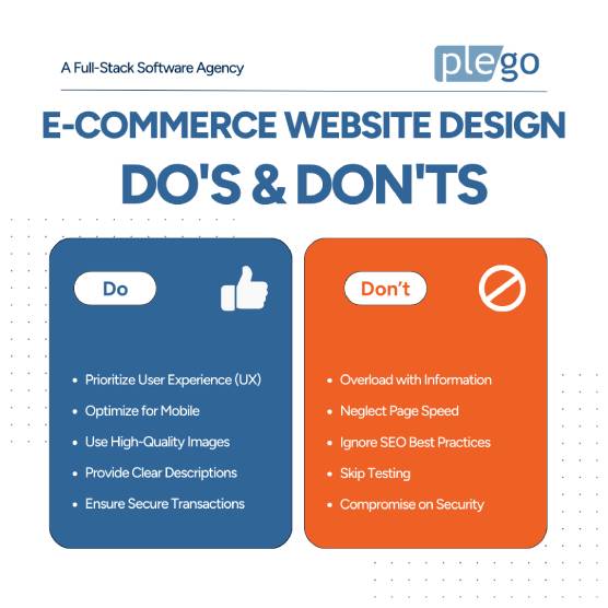
Do’s for E-commerce Website Design:
- Prioritize User Experience (UX)
Think about your customers’ journey. Make your site a breeze to navigate with simple menus and clear calls-to-action. A smooth, intuitive experience can really boost your sales. - Optimize for Mobile
Many users browse on their phones these days. Ensure your site performs seamlessly on all screen sizes. It’s a must! - Use High-Quality Images
Present your products with professional, high-resolution photos that highlight their features beautifully. People love to see what they’re buying. - Provide Clear Product Descriptions
Write engaging, detailed descriptions that answer potential questions. Clear, informative content helps build trust and makes people more likely to hit that “Buy Now” button. - Ensure Secure Transactions
Keep your customers’ data safe with SSL certificates and other security measures. A secure website builds trust and keeps people coming back.
Don’ts for E-commerce Website Design:
- Overload with Information
Don’t clutter your site with too much info or too many products on one page. This can overwhelm visitors and lead to a higher bounce rate. Keep it clean and focused. - Neglect Page Speed
Slow loading times can frustrate users and drive them away. Optimize images, leverage browser caching, and minimize code to keep your site fast and efficient. - Ignore SEO Best Practices
Optimize your product pages with relevant keywords, meta descriptions, and alt text for images. Good SEO practices help improve your site’s visibility on search engines. - Skip Testing
Regularly test your website for bugs and issues. User testing can provide valuable insights into how customers interact with your site and highlight areas for improvement. - Compromise on Security
Security is key. Make sure you have robust measures in place to protect your business and customer data.
We all know how crucial it is to get your e-commerce site off the ground, right? But let’s be real, creating an online store that not only looks good but also functions smoothly can be quite a challenge.
That’s where focusing on the right strategies comes into play! By paying attention to some essential dos and don’ts, you can navigate the complexities of e-commerce design and build a site that stands out.
Ready to see your e-commerce site reach its full potential? Let’s collaborate and create something truly impressive together.
